The Ragamuffin Bakery Hires Keur Design Studio for Branding and Website Design
In the summer of 2021, Abigail Emmons of The Ragamuffin approached Keur Design Studio with a problem. She had a brand new website for the bakery, but she was not satisfied with the results.
The website was functional in sharing the bakery’s hours, location, and offerings. However, the look, feel, and energy of the design did not capture the heart and soul of the bakery.
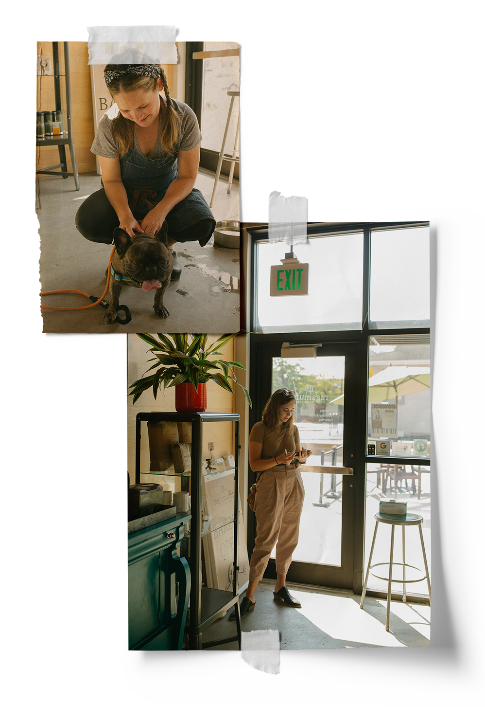
Walking into the bakery on any given day, customers are greeted with warmth, generosity, and community. The smell of cinnamon rolls baking plus the joy and energy of the staff fills the air with warmth. This is the type of experience we wanted to pull through each of the brand’s touch-points.
Project Goals

To create a memorable visual experience for The Ragamuffin's customers that celebrates the bakery's welcoming and approachable nature

To craft a creative online experience that reaches new customers and offers information on all The Ragamuffin has to offer

To showcase the credibility of The Ragamuffin by having a creative and cohesive brand presence across all platforms
STEP #01:
Brand Strategy & Creative Direction
Before diving into the website design, it was essential to identify the heart and soul of the brand in order to create visuals that share a cohesive message.
Kath sat down with Abigail for a conversation about the history of The Ragamuffin, why Abigail decided to create the bakery, and what the ultimate vision for the business is. Out of that conversation, Kath pulled together a strategy that overviews the brand purpose, target audience, key words, and personality.
We then set in motion a plan of visual elements that would convey this to the bakery’s audience in a visual way.
STEP #02:
Brand Refresh
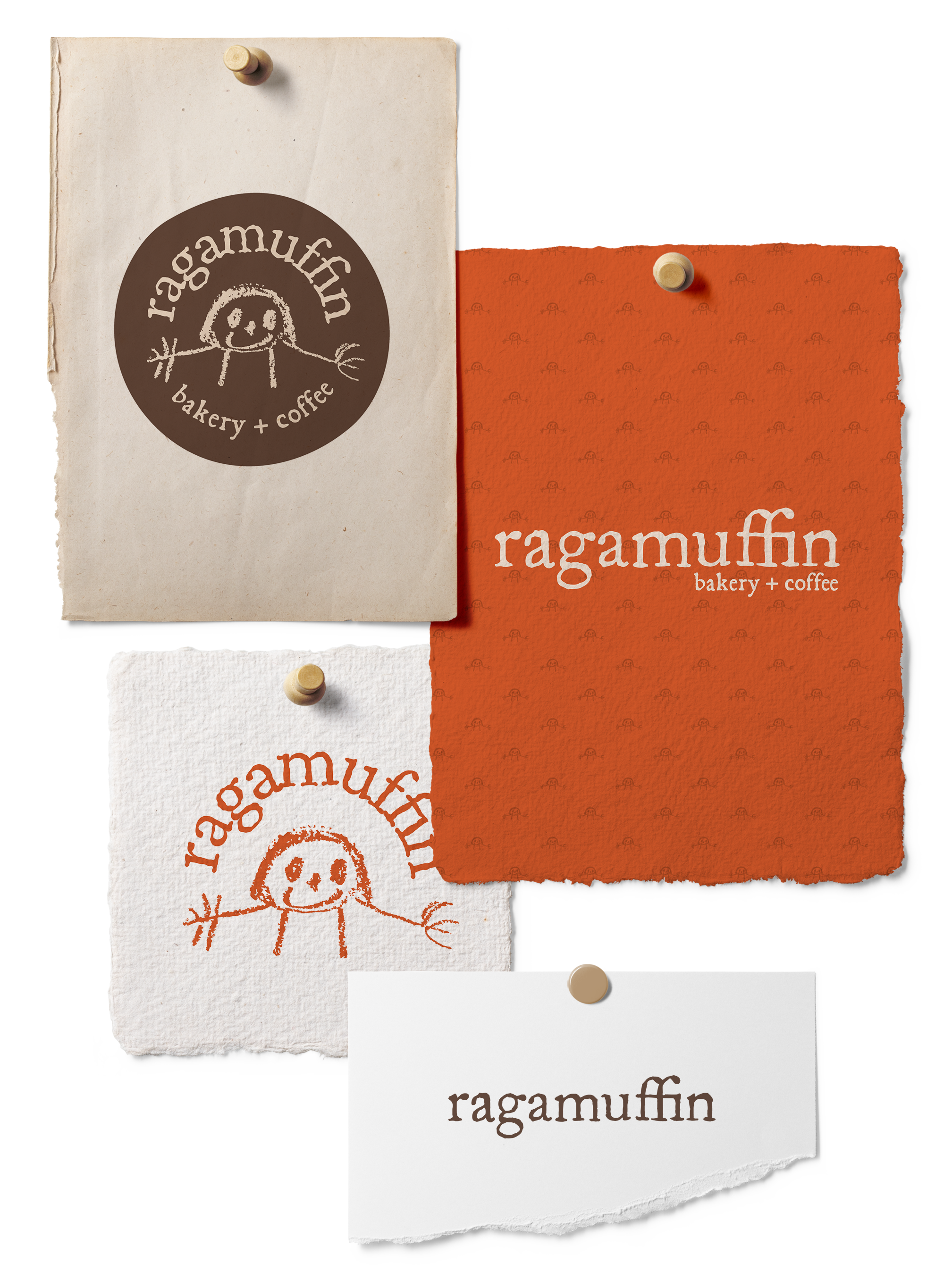
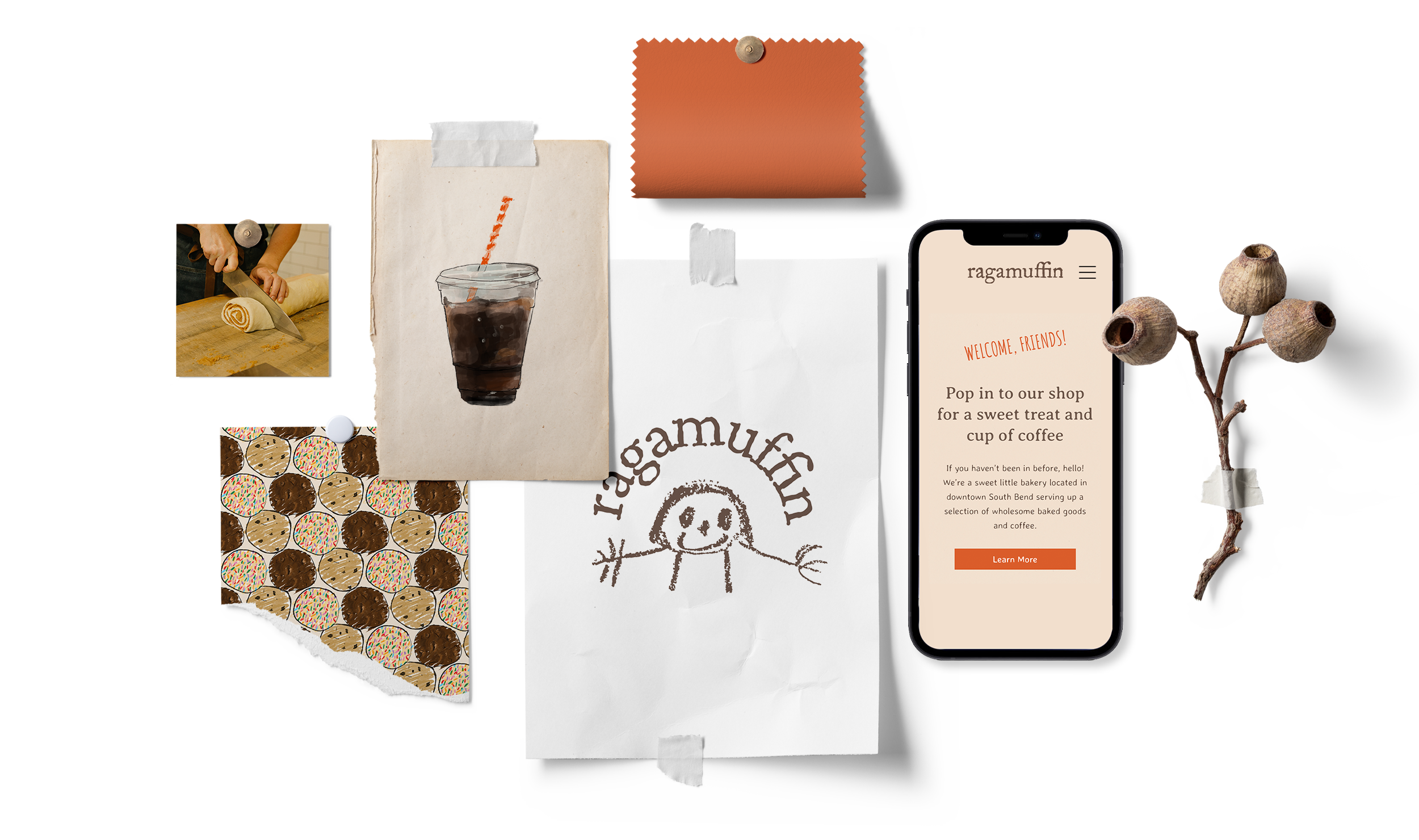
In discussing the logo concept, Abigail was clear that the icon and word mark from the original logo should remain unchanged. The hand-drawn illustration held history and memories for Abigail. For decades, this sketch by her brother hung in the family kitchen during many baking sessions with her grandmother.
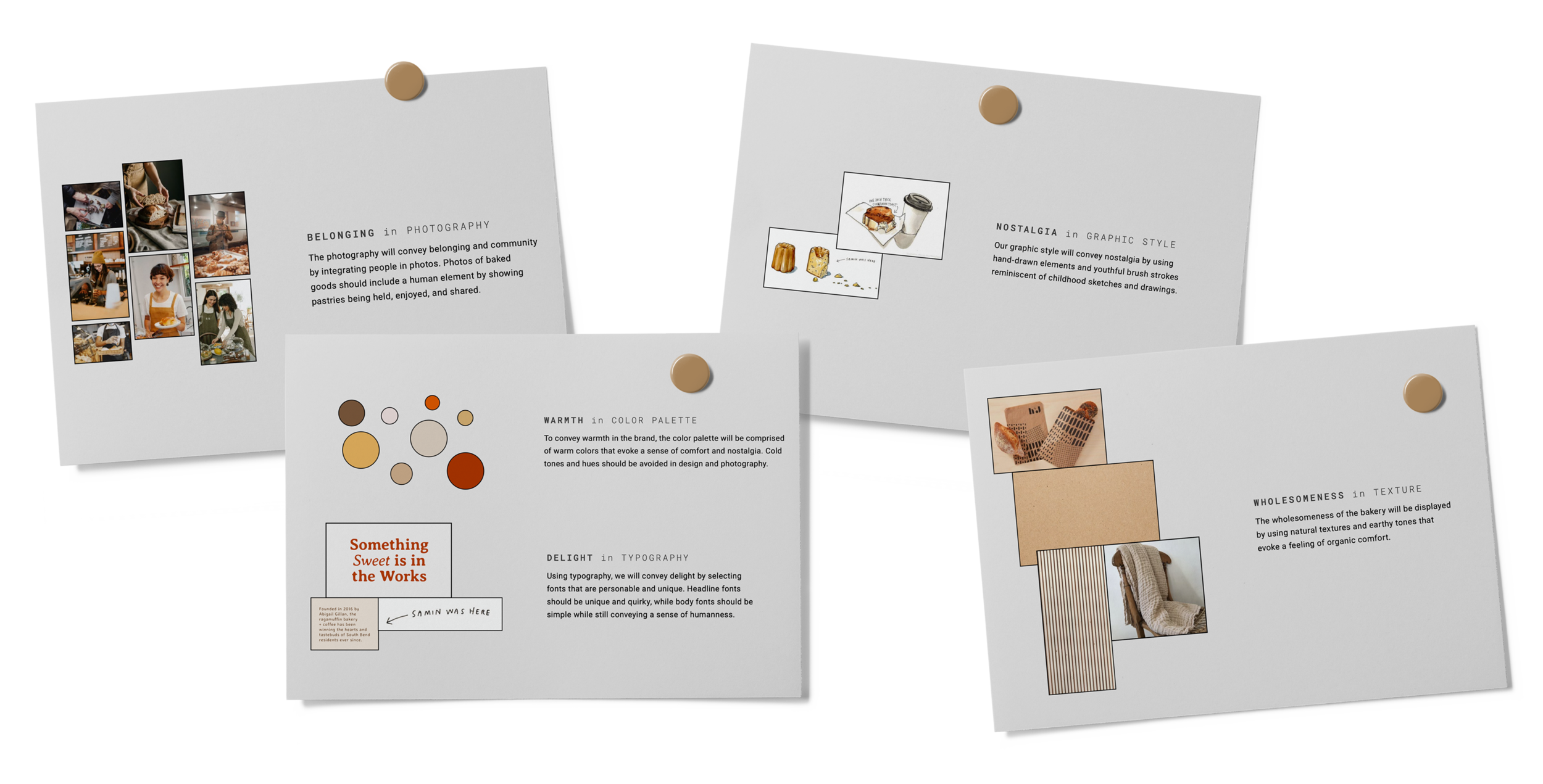
In order to support the existing logo, it was necessary to build out a package of elements to visually convey the heart and soul of the brand. The final brand guide included a variety of complementary logos, a color palette, and a typography set.
STEP #03:
Custom Illustration
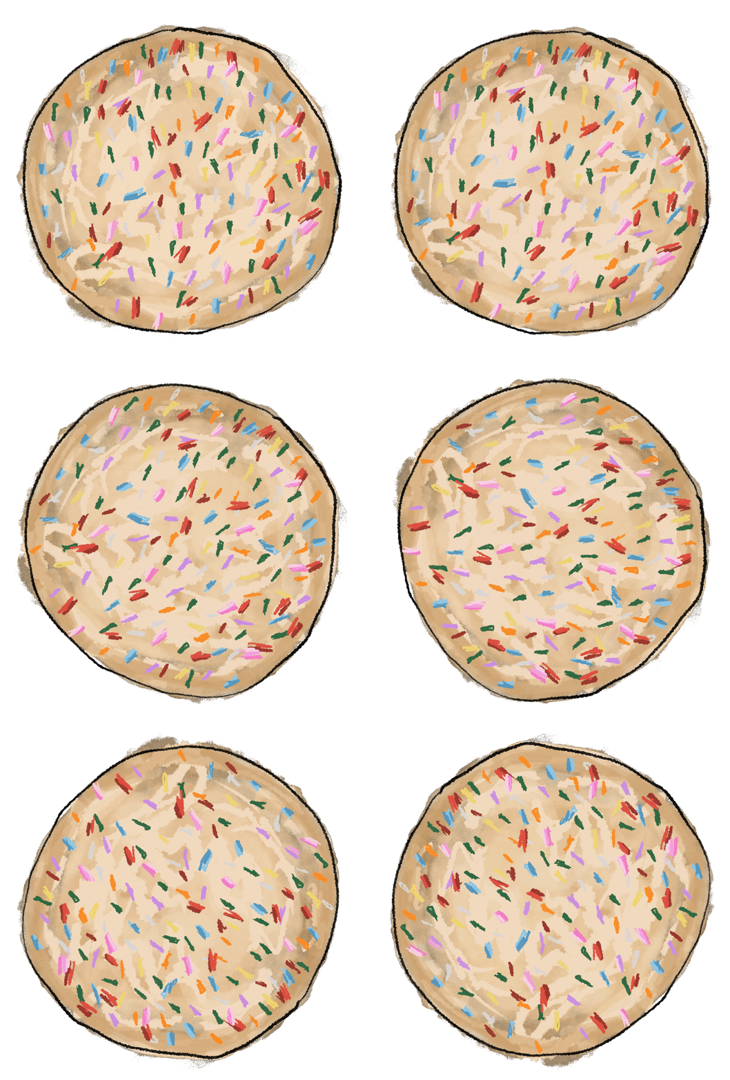
In addition to the essential brand elements, Keur Design Studio provided cute, child-like illustrations and animations as an integral way to convey the warmth and nostalgia of the bakery in a visual way.
Kath of Keur Design Studio illustrated a library of cookies, baked goods, and coffee for use throughout the website, social media, and other brand touch-points.
STEP #04:
Photography Session
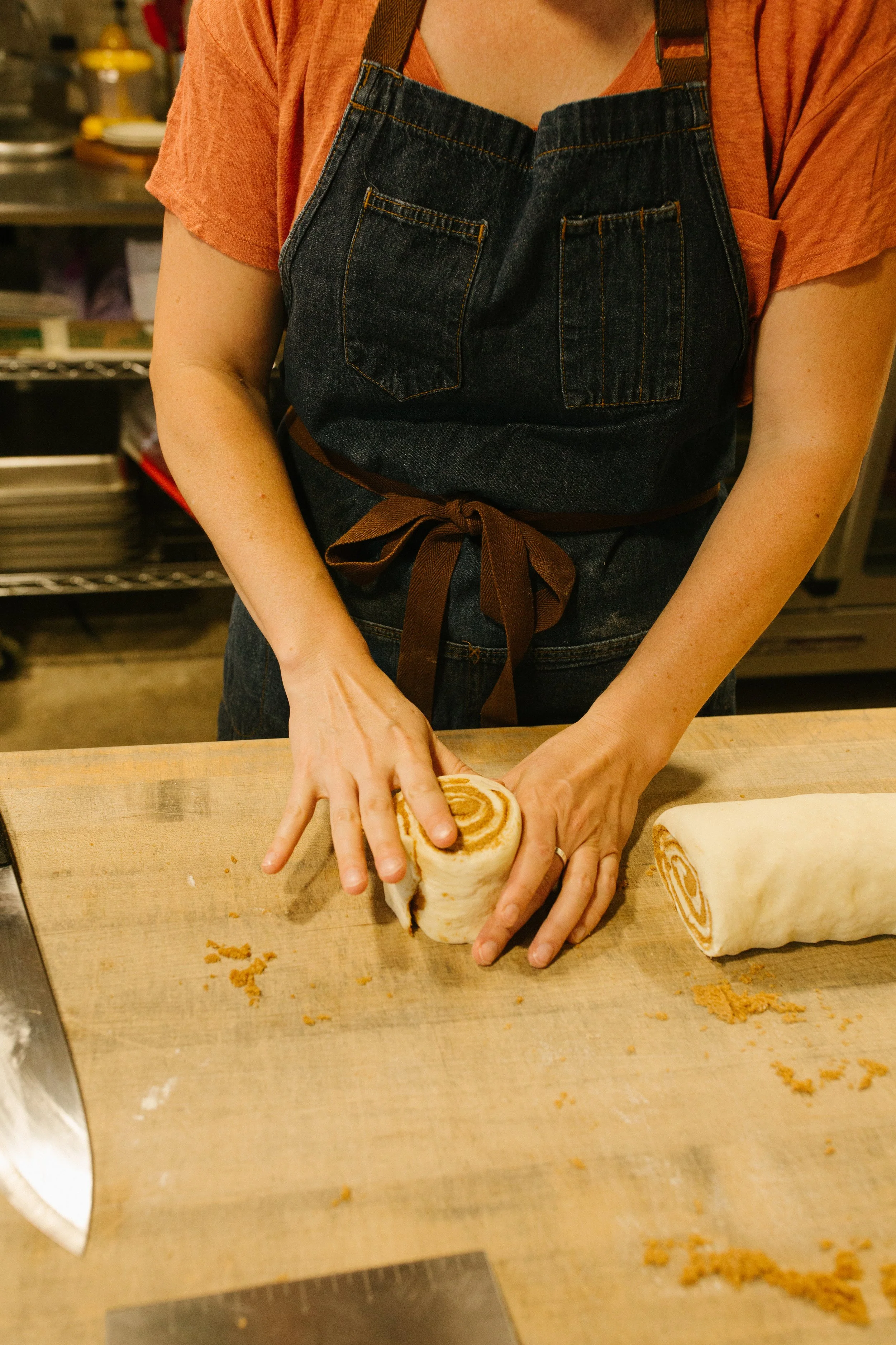
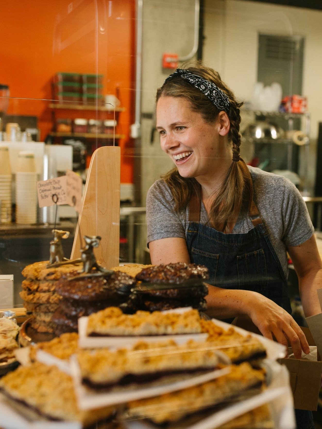
Partnering with Morgan Hoogland Photography, we held a photography session to capture the heart and soul of The Ragamuffin.
It was essential that each photo include some kind of human interaction in order to display the community of customers and bakers that create warmth and wholesomeness of The Ragamuffin.
STEP #05:
Website Design
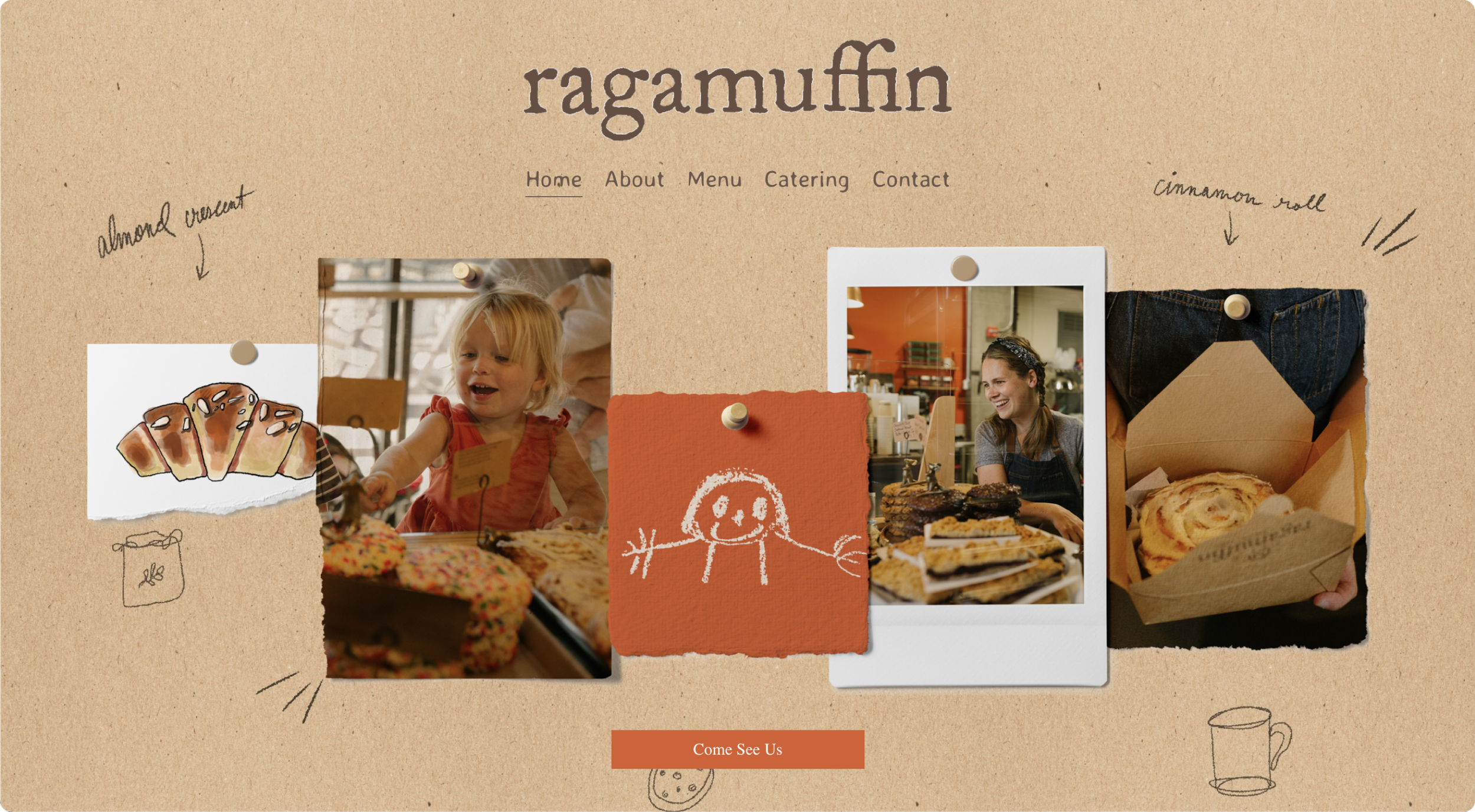
Using cute animations, hand-drawn elements, and textural graphics, the web experience feels real and tangible and full of humanity. The headlines and paragraph texts were written in a conversational way, as though speaking to friends.
The website was developed on Squarespace in order to provide Abigail with easy access to update hours and offerings. Integrating illustrated graphics and custom-coded sections, we were able to achieve a one-of-a-kind look while still being extremely easy to maintain.

