The Early Bird Eatery Hires Keur Design Studio for Brand Redesign
It was January of 2022 when I met Jenn and Mike Stone for the first time, though I had known of them for quite awhile longer.
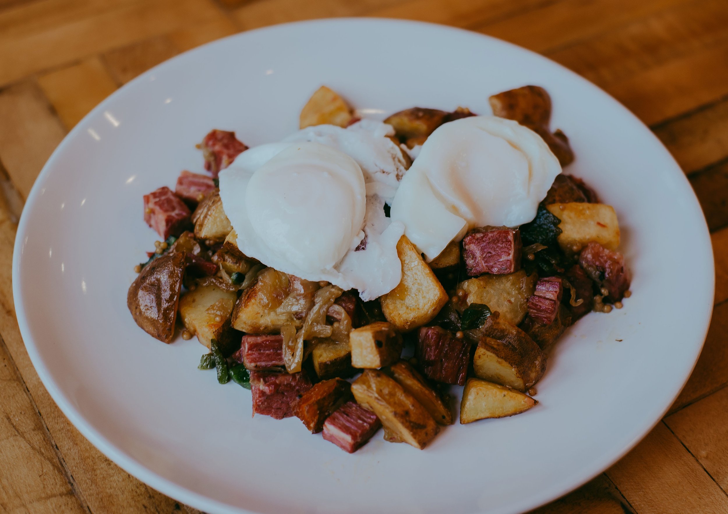
You see, they are the owners of The Early Bird Eatery, and during those days, I was a little bit obsessed with their blueberry lemon pancakes and biscuits and gravy. The food was familiar, nostalgic, but with an elevated take that we don’t often see in our small city of South Bend, Indiana. I was hooked.
At the time, The Early Bird Eatery was just settling into their new home in Dainty Maid Food Hall, but the restaurant was already bursting at the seams of the shared space. So they purchased a building around the corner and were preparing for another, this time permanent move.
The restaurant already had a loyal following—if you’ve had their home fries, you know why—but for a restaurant, three locations in three years is a little bit of a communication nightmare. So Jenn and Mike reached out to me to help navigate this transition and build a brand that they could be proud of—one that would be the foundation for their business for years to come.


Step 01: Brand Strategy
Before beginning design, we met to outline the story of The Early Bird Eatery and identify the unique characteristics that set this brunch cafe apart from others in South Bend, Indiana. Jenn and Mike’s shared their vision for the cafe:
1) Create a perfect balance of upscale and approachable.
2) Highlight local, fresh ingredients in scratch-made dishes
3) Raise the bar on flavorful food with consistent, familiar classics

Step 02: Brand Design
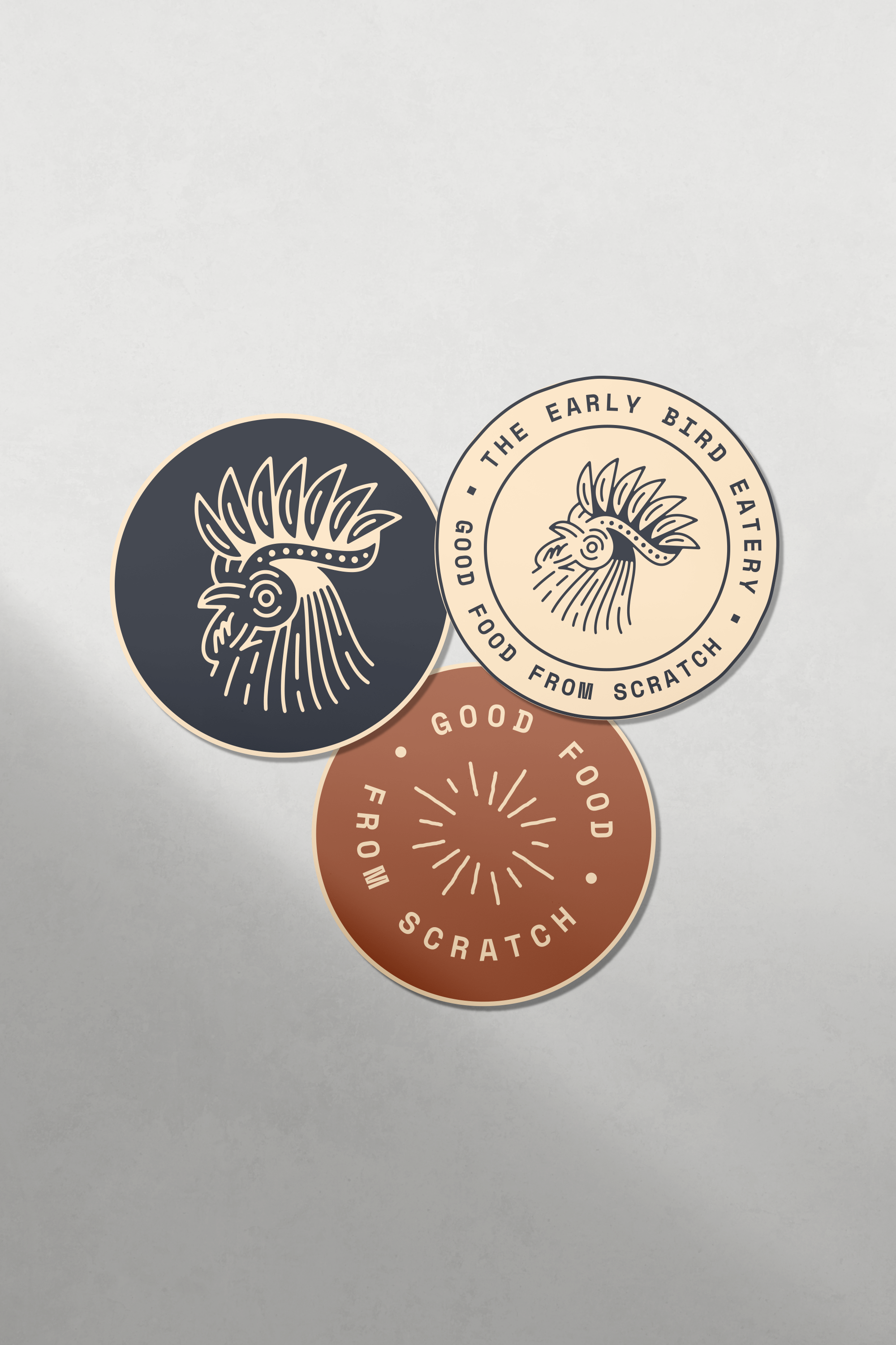
The Early Bird Eatery had a logo that they were happy with—a simplified rooster head with clean, smooth lines—but didn’t have any supporting elements. So with the goals and creative direction outlined, it was important to design a new brand system.
Together we created a brand that integrates a refined mid-century-modern inspired color palette alongside bold shapes and funky typography. The goal was to be modern, but still familiar and inviting.

Step 03: Facade Design
The Early Bird Eatery’s new building featured an 80 foot frontage in a high-traffic area, so investing in an exterior design that grabs travelers’ attention was important to the cafe’s success in transitioning to the new location.

Step 04: Menu Design
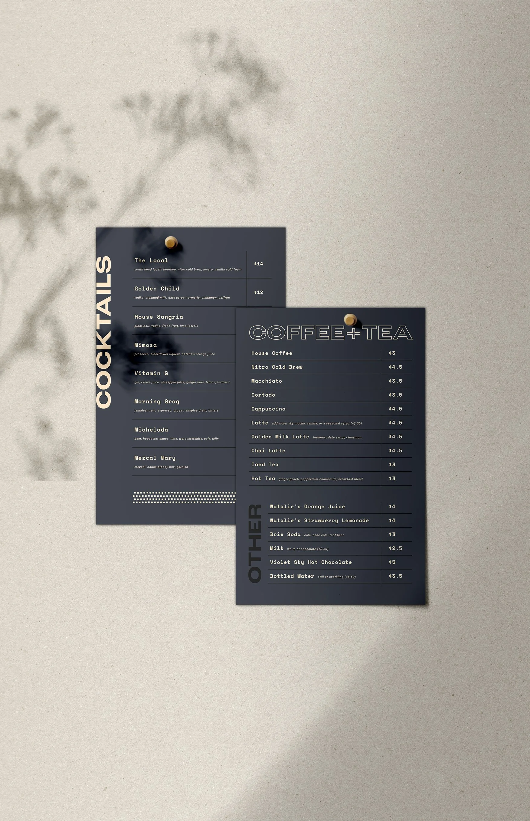
At their previous location, The Early Bird Eatery relied on QR-code menus. Now, they present an upscale menu printed on oversized linen paper to elevate the dining experience and allow customers the option to stay off their phones.
I created templates for the menu so Jenn could update it on her own without needing to rely on me for every menu change.

Step 05: Website Design
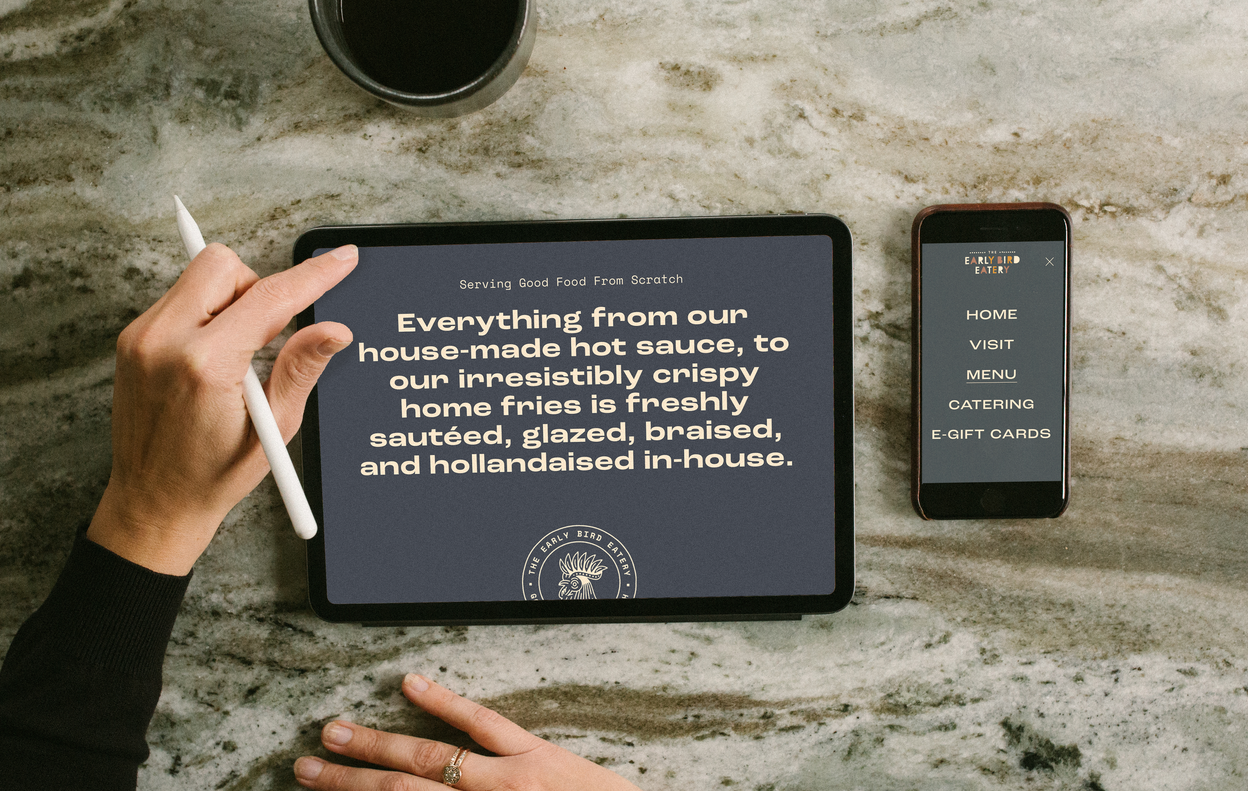
The Early Bird Eatery’s previous website was difficult to navigate and especially challenging to view on mobile. Plus, the content and design didn’t represent the brand’s elevated approach to traditional comfort food.
In the new website custom-coded on Squarespace, customers can easily navigate the menu learn about The Early Bird Eatery’s commitment to delicious scratch-made food.
With Squarespace, Jenn can easily update essential information like images, text, menu, and hours without the need to hire a web developer.
